Sunday, May 29, 2011

Lab 8 (Final Project)


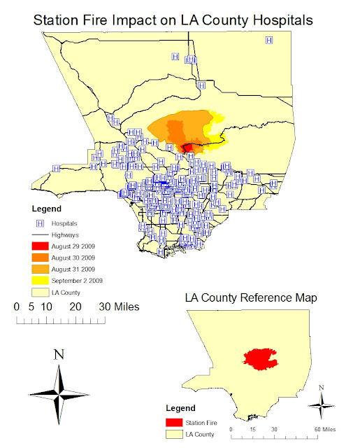
The map shown above titled Station Fire Impact on LA Hospitals, shows the spread of the Station Fire from late August to early September. This map is a thematic map, as it focuses on the proximity and impact of the fire on one single theme: hospitals. Additionally, major highways are shown in order to provide the viewer perspective on location within Los Angeles County. The aspect used within the thematic map is hospitals, specifically those under threat as a result of the fire spreading. As evidenced above, there are several hospitals that were directly within the fire boundary. Below the thematic map is a reference map that shows the extent of the Station Fire within Los Angeles County.

The Station Fire was the largest and deadliest wildfire in Los Angeles County in 2009, killing two firefighters. The fire originated in the Angeles National Forest, and spread northward, in the direction of wind and increasing elevation. As the fire grew, it also expanded both in the east and west directions from its origin, as evidenced by the thematic map showing the time overlay of the fire. The images shown below, bring to life the severity and intensity of the Station Fire:


The theme of the map introduced here is Los Angeles County hospitals impacted by the Station Fire. From this map, several hypotheses arise. First, from the time lapse of the Station Fire, one can hypothesize that the fire moves northward. The reason for this is a combination of the wind direction and increasing elevation. Though the digital elevation model is not provided in the above maps, basic geographic knowledge of Southern California will support this claim. Similarly, wind direction is not readily discernable from the maps above, however, the wind direction can be obtained from literature sources.

Secondly, an additional hypothesis is that Los Angeles County Hospitals were not forced to evacuate their patients because the Angeles Forest was north of most hospitals in close proximity. Thus, as the fire expanded, it did so away from the hospitals. If however, the fire was not put out in the timely manner it was, several hospitals north of the epicenter would have required evacuation. This is due to the spread of the fire in both east and west directions, where several hospitals are located.

Another hypothesis is that due to road closure from the Station Fire, residents in smaller communities north of the Angeles Forest were unable to reach their local hospitals. Since precautionary evacuation measures were taken, these communities were helped by medical responders and evacuation teams. As a result the danger of people needing and unable to reach medical care was averted through careful planning.

From the thematic map created, it is evident that the Station Fire took place in an area of low population density. This finding is inferred since the number of hospitals in a given area is directly proportional to the population. The region in which the Station Fire occurred is away from major highways and hospitals, as it was in a forest. Though some communities were affected, major population centers like Downtown, West LA, and the Southbay were unaffected. Moreover, a thematic map like the one displayed brings to life the character of the Station Fire as it pertains to a certain theme, in this case hospitals.

Bibliography:

  1. "All Station Fire Perimeters." Los Angeles County Enterprise GIS. WordPress & Atahualpa, 2011. Web. 28 May 2011. <http://egis3.lacounty.gov/eGIS/?p=1055>.
  2. Bloomekatz, Ari B. "Station Fire Was Arson, Officials Say; Homicide Investigation Begins."LA Times. Tribune, 3 Sept. 2009. Web. 30 May 2011. <http://latimesblogs.latimes.com/lanow/2009/09/station-fire-was-arson-homicide-investigation-begins.html>.
  3. "CAL FIRE Incidents." California Department of Forestry and Protection. State of California, 2011. Web. 26 May 2011. <http://cdfdata.fire.ca.gov/incidents/incidents_details_maps?incident_id=361>.
  4. "2009 California Wildfires." Wikipedia. 6 May 2011. Web. 26 May 2011. <http://en.wikipedia.org/wiki/2009_California_wildfires>.
  5. "UCLA's Spatial Data Repository." Map Share. University of California Los Angeles, 18 Feb. 2009. Web. 26 May 2011. <http://gis.ats.ucla.edu/Mapshare/>.

Sunday, May 22, 2011

Lab 7 (Week 8)


The black population across the continental United States can be seen above. The greater the black people in the county, the closer the color is to red. Almost the entire United States is shaded in yellow, suggesting that most of the black population is localized to a few counties. Specifically, the Midwest is almost completely void of large black populations, with the exception of Detroit and Chicago. This can partly be attributed to the fact the areas are less urbanized. The most black-rich areas can be found in California, the Southeast, and the East Coast. Southern California in particular has a very large black population, which is accentuated by the large county areas neighboring Los Angeles. The South and East Coast have much smaller counties with respect to area, thus their black populations are less evident visually through this map. In reality, there are significant black populations throughout these regions, which amass to a greater number of blacks than in California. This conclusion is not evident through the above map.

The asian population across the continental United States is shown above. The color ramp used to display asian populations uses dark blue to signify the greatest asian population and yellow to signify the smallest asian population. The asian population is almost entirely localized to the West and East Coast. With the exception of Texas, Colorado, Illinois, and Michigan, the entire Midwest is absent of significant asian populations. California is visually the greatest asian containing state. From the Bay Area down to San Diego, there are asian rich populations in counties that span large areas relative to the East Coast. There is also a significant asian population ranging from Maryland to New York along the Atlantic, but the small county sizes make this group less visually evident. Historically, the asian population is very well-educated and localized around white collar business hubs like the Bay Area, Los Angeles, and Manhattan.


The some other race alone population is shown above across the continental United States. The color ramp used shows large populations in purple and small populations in pink. Almost the entire continental United States is shaded in pink and absent of significant some other race alone populations. California, Arizona, Texas, Florida and the East Coast are in exception to this rule. California is again highlighted for its rich diversity. As the case before, the large county areas help highlight the some other race alone populations. While counties along the East Coast have significant some other race alone populations, they are less evident visually. The entire Midwest is once again almost completely void of some other race alone populations.

In conclusion, the census map series shown above have highlighted regions within the continental United States that are rich in population diversity. California is the most evident state with rich diversity. This is partially due to the almost 37 million person population of California, which accounts for more than 10% of the United States population. The large population coupled with large urban areas and the great number of blue collar and white collar jobs make California rich in diversity. In contrast, most Midwest states have populations on the order of 1 million, making those states incapable of possessing populations of minorities that meet the larger tier specifications. As a result, there appears to be limited diversity. In reality, some of these regions may be rich with minorities on a percentage basis. Looking at these census maps on a percentage black, asian, or some other race alone basis should provide an interesting contrast.

Sunday, May 15, 2011

Lab 6 (Week 7)

The maps/graphics found below consist of a DEM based shaded relief model, slope map, aspect map, and 3D image:

All the maps and graphics make use of the GCS NAD 1983 as their reference geographical coordinate system. The location presented spans left to right from -119.23 decimal degrees to -119.17 decimal degrees. From bottom to top, the map spans from 34.27 to 34.34 decimal degrees. A decimal degree corresponds to roughly 100 km in this region. Originally, I was going to us Lake Tahoe, California as the study location. Due to the high internet traffic at the USGS website, I was unable to download the aforementioned location. As a result, the TA provided this specific location, which corresponds to the mountain range north of Oxnard and Ventura. Ventura Country lies right smack between several mountain ranges and is bordered on its west coast by the Pacific Ocean. These mountains (pictured) are part of the Transverse Mountain Ranges of Southern California. Specifically, the mountain range directly north of Ventura and Oxnard is known as the Topatopa Mountains. This range approaches elevations of nearly 7,000 feet at its peak.

Saturday, May 7, 2011

Lab 5

Equidistant Map Projections:

Equidistant Conic Distance from Washington DC to Kabul = 6,964 miles
Sinusoidal (World) Distance from Washington DC to Kabul = 8,111 miles


Equal Area Map Projections:

Bonne Distance from Washington DC to Kabul = 7,053 miles
Goode Homolosine (Land) Distance from Washington DC to Kabul = 10,025 miles


Conformal Map Projections:

Mercator (World) Distance from Washington DC to Kabul = 10,204 miles
North Pole Stereographic Distance from Washington DC to Kabul = 7,605 miles


Write 4 paragraphs about map projections be sure to reference your 6 maps:

In its most simple terms, a map projection is the representation of a 3-dimensional earth on a 2-dimensional surface. In order to construct a map projection it is necessary to select a datum to mathematically transform the earth into two-dimensions. When constructing a map projection, you have several developable surfaces to make use of: planes, cylinders, and cones. The selection of this developable surface and its center impact the resulting distortions. It is not possible to create a map projection without distorting certain map elements. Thus, map projections are categorized by the qualities in which they preserve. Conformal map projections preserve direction, equidistant map projections preserve distance, and equal area map projections preserve area.

The equidistant map projections map projections created in this lab were equidistant conic and sinusoidal. equidistant conic (or simple conic) map projection shown above, is neither equal-area nor conformal. Its distances are only preserved along the meridians and one or two standard parallels. As seen, the conic projection is unwrapped from a cone. Equidistant conic map projections are typically used in atlases to highlight regions around the middle latitudes. The distance from Washington D.C. to Kabul is 6,964 miles with the equidistant map projection compared with an actual distance of 6,956 miles. Since Washington D.C. and Kabul lie near the same latitude on the map, their distance is preserved without much distortion. In contrast, the sinusoidal (world) map projection seen above has a distance from Washington D.C. to Kabul of 8,111 miles. A sinusoidal projection is both an equal area and equidistant map projection. The distances between two points along the same meridian is preserved with this map projection. Thus, a sinusoidal map projection is effective for finding distances along the same meridian, but is problematic for measuring distances along parallels and far from the same meridian, which is the case with Washington D.C. and Kabul.

Equal area map projections are defined by preserving the same area proportionality on the map as on the ground. In this lab, Bonne and Goode Homolosine (Land) equal area map projections were constructed. The Bonne map projection is pseudoconical and has no distortion along the central meridian and standard parallel. The distance from Washington D.C. to Kabul is 7,053 miles, which is close to the actual value of 6,964 miles. Distortion primarily occurs along the edges of the map. Since Kabul and Washington D.C. are both near the central meridian, there is minimal distortion in their distances. In contrast, the distance between Washington D.C. and Kabul is 10,025 miles using the Good Homolosine (Land) projection. This projection is well suited to highlight spatial distributions of water and land, as it minimizes distortion throughout the world. The projection is a combination of Sinusoidal and Mollweide projections. Distances are not distorted close the standard parallel (equator) and the central meridian. Since both Washington D.C. and Kabul lie away from the center of the map, their distances are significantly distorted.

Conformal map projections are characterized by the preservation of angles locally. In other words, direction is maintained as it appears on earth. In this lab, Mercator (World) and North Pole Stereographic conformal map projections were constructed. Mercator map projections were a staple in nautical exploration, since lines represent constant directions. As a result, area is drastically distorted along the north and south poles, as evidenced by the blown-up size of Antarctica and Greenland. The distance from Washington D.C. to Kabul is 10,204 miles with the Mercator map projection, which shows significant distortion in distance. Since Washington D.C. and Kabul are not near the standard parallel (equator) their distance is significantly distorted. The North Pole Stereographic map projection shows lesser distortion in distance between Washington D.C. and Kabul (7,605 miles). All stereographic projections project spheres onto a plane from a single point, in this case the North Pole. The farther south you go along a meridian, the greater the distortion in distance and area becomes. Since Washington D.C. and Kabul are both near the north pole in the projection, their distances are minimally distorted.